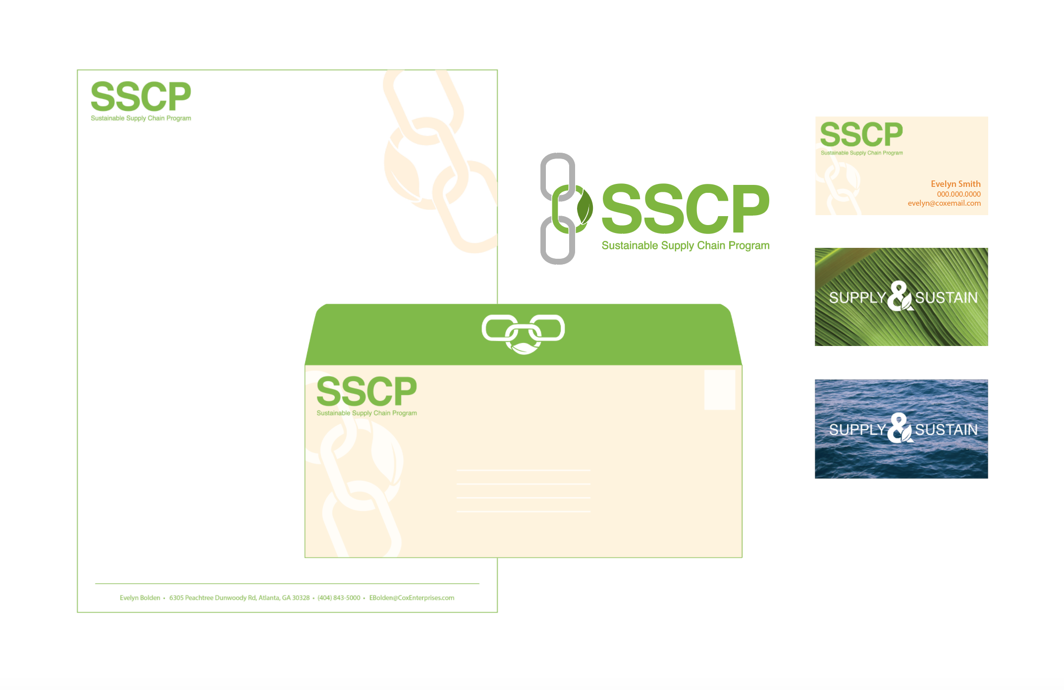
SSCP Logo & Branding
Cox Media started a new program within their Cox Conserves division that will be focusing on creating a more sustainable supply chain for themselves as well as their vendors. They needed a full logo and branding package for this initiative and an infographic with corresponding presentation slides to help pitch the program to various department heads.
I chose a minimal and clean typeface due to the professional audience for this branding. The color green was key to subconsciously drive home the “green initiative” concept, paired with a bright orange to create a sense of important and urgency. Earthtones (like the cream and charcoal) along with natural textures were added to contrast the corporate minimalism and add interest.
I’m happy to say the clients were very pleased with my work and look forward to working with them again in the future!


